Why start from a reference
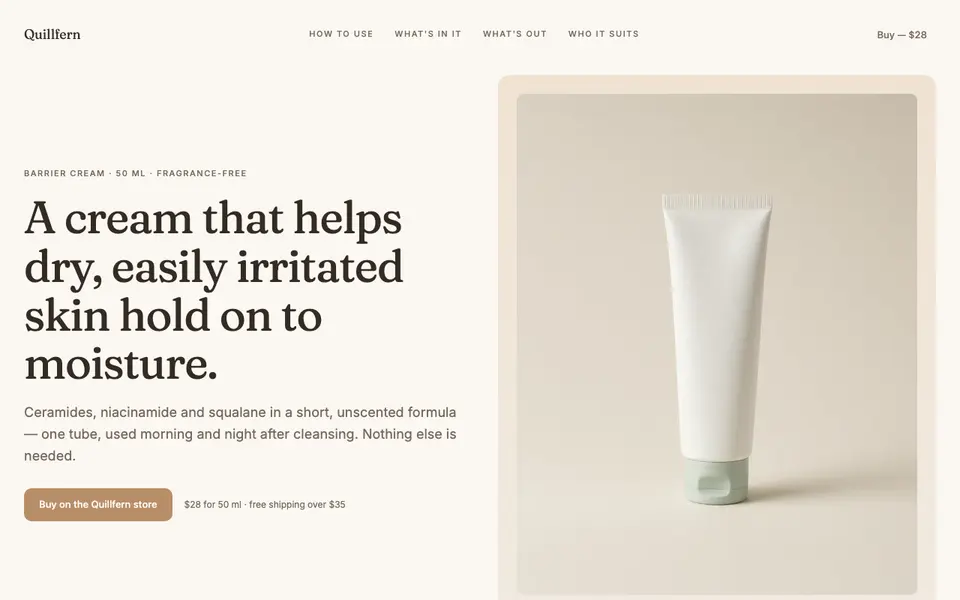
Describing a look in words is hard. “Clean, editorial, a bit premium” means something different to every designer. A screenshot settles the question in seconds: everyone can point at the same thing and say “like this”.
A reference is most useful when you already know what the page has to say and only need help with how it should look. If the content is still unclear, sort that out first; a borrowed layout will not fix a page that does not know its message.
What to take from the screenshot
Look at the screenshot as a set of design decisions, not as a picture. Write down the decisions you want to keep:
- Structure. The order of sections and roughly how much space each one gets.
- Density. Generous white space and few elements, or a busy page with lots to scan.
- Surface treatment. Hairline borders or none, soft or hard shadows, sharp or rounded corners.
- Image style. Full-bleed photography, product cut-outs, illustrations or no images at all.
- Decoration. Dividers, labels, badges, background textures and other small details that set the tone.
Colours and fonts are a separate question. If you have a brand, they should come from your brand, not from the screenshot (see the section on keeping it yours below).
Where a reference ends and copying begins
Layouts and visual styles are shared freely across the web: nobody owns “a large photo on the left, text on the right”. The words, images and brand marks on someone else’s page are a different matter.
| Fine to take | Do not take |
|---|---|
| The order and rhythm of sections | Their headlines, body copy or slogans |
| Spacing, borders, shadows and corners | Their photos, illustrations or icons |
| The general type of image they use | Their logo, product names or trademarks |
| The idea of a comparison table or a testimonial strip | Their reviews, quotes, figures or claims |
A good test: if someone who knows the original saw your page, they might think “similar style”, but they should never think it is the same company.
How to build the page, step by step
- Write the content first. Headline, sections and the main action, in your own words.
- Pick one or two references. More than that and the page ends up as a mix of styles that do not fit together.
- List the decisions you are borrowing, using the categories above.
- Apply your own colours and fonts to those decisions.
- Use your own images, or images you have the right to use.
- Compare the result side by side with the reference. Check that the feel carried over and that none of their content did.
Keeping the result in your brand
The risk with references is that every new page looks like a different company. The fix is to separate the two layers: let the reference shape the layout and surface details of one page, and let your brand decide the colours and type on every page.
If you do not have written brand rules yet, see what a design system is for landing pages and how to keep every landing page on brand.