Check in the order visitors read
Visitors decide quickly whether a page is worth reading, then scroll for the answers to their doubts. The checklist follows that order: what they see first, what they need explained, what makes them trust it, and how they act.
The first screen (checks 1–3)
- The headline says what it is and who it is for. A visitor who reads only the headline should know whether the page is for them.
- The main image shows the product. Not a mood photo: the product itself, or the product in use, large enough to see.
- The price and the main button are easy to find. Hiding the price makes people scroll looking for it, and many leave instead.
The explanation (checks 4–7)
- Benefits come before specifications. Say what changes for the buyer first; put dimensions and materials further down.
- It shows how the product is used. Steps, a short routine or a picture of it in place.
- It says what is inside, and why. Ingredients, materials or components, each with a reason.
- It says who it is not for. Naming the wrong buyer builds trust with the right one and reduces returns.
Trust (checks 8–10)
- Reviews are genuine and specific. Real customers, used with permission, describing a real result. Never write them yourself.
- Shipping, returns and guarantees are stated plainly. Near the button, not only in the footer.
- The obvious objections are answered. A short FAQ covering price, fit or compatibility, and what happens if it does not work.
The call to action (checks 11–12)
- There is one main action, repeated. The same button at the top, after the explanation and at the end. Secondary links should not compete with it.
- The whole page works on a phone. Text is readable without zooming, buttons are easy to tap, images load quickly and the button is reachable without a long scroll.
An example, checked
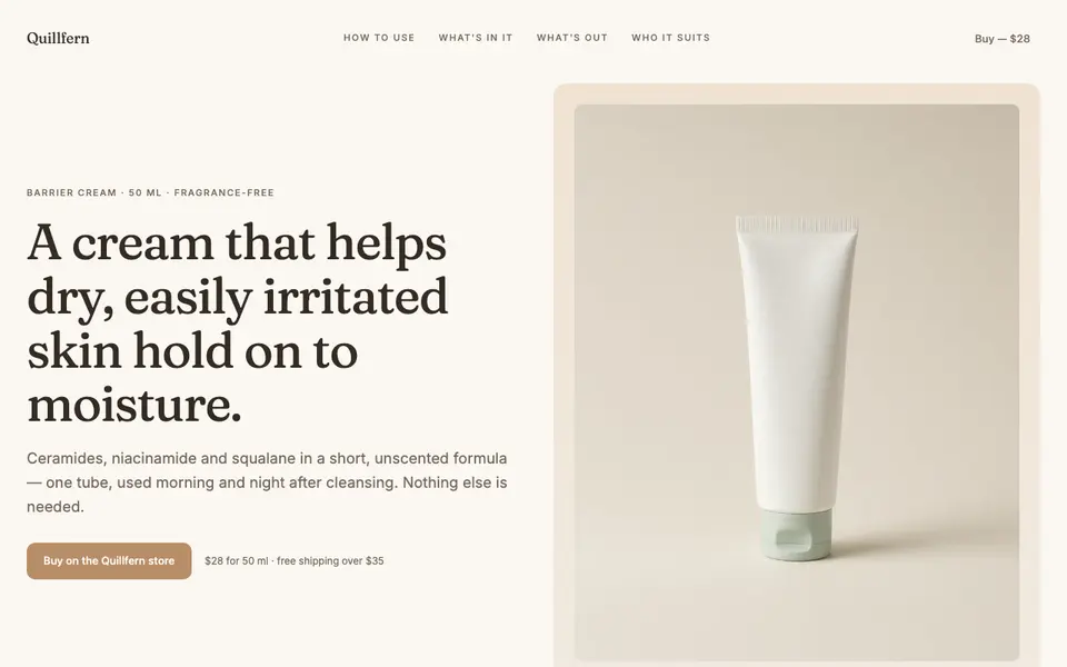
The headline says who it is for and what it does: “A cream that helps dry, easily irritated skin hold on to moisture.” The page then covers use (“Two steps, morning and night”), what is inside (“Three ingredients, and the reason each one is there”), what is left out (“Three things that are not in the tube”) and who it suits, including people who should patch-test first. It ends with one offer: one tube, one price, one store.
The checklist, in one list
- Headline says what it is and who it is for.
- Main image shows the product.
- Price and main button are easy to find.
- Benefits come before specifications.
- It shows how the product is used.
- It says what is inside, and why.
- It says who it is not for.
- Reviews are genuine and specific.
- Shipping, returns and guarantees are stated near the button.
- Obvious objections are answered.
- One main action, repeated.
- The page works on a phone.