What to look at in an advertorial example
When you study an advertorial as a seller, the wording matters less than the decisions behind it. For each example below, look at four things:
- The headline: is it the buyer’s question or a claim about the product?
- The first half: would it be worth reading if the product did not exist?
- The switch: how does the page move from advice to the product, and where?
- The offer: what reduces the risk of buying — a trial, a guarantee, free returns — and is there only one action?
All six pages were generated with Octet Prow for fictional brands, then checked for invented facts. Each example’s page lists the brief we typed, the design system and what we changed.
1. Explainer: a sleep advertorial
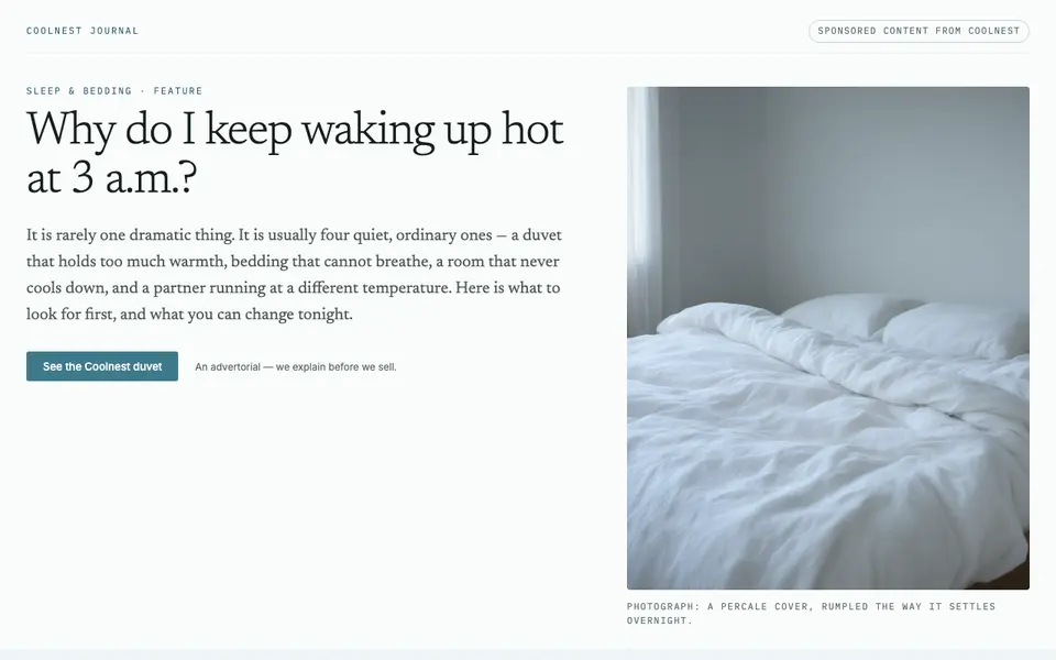
The headline is the reader’s own late-night question. The first half explains four ordinary reasons a bed runs warm and gives six changes that cost nothing. The duvet arrives as the next step “if the list above did not fix it”, with a 100-night trial to lower the risk. Use this format when your buyer has a problem they cannot explain yet.
2. Label guide: a pet food advertorial
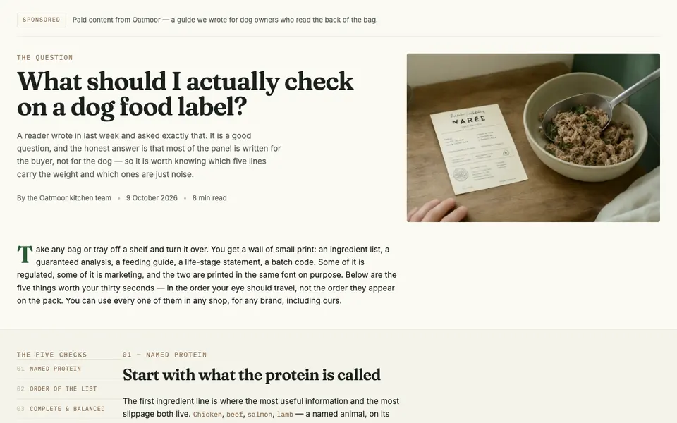
The page teaches five things to check on any dog food label. When the product appears, it is read against the same five checks, so the comparison feels like the reader’s own test rather than a sales pitch. The offer is a discounted first box. Use this format when your product wins on criteria the buyer can learn to check.
3. Listicle: a running shoe advertorial
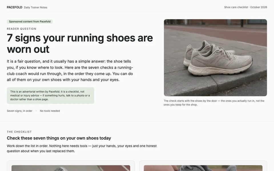
Each of the seven items has a heading that makes the point on its own, a photo of that sign and a short “how to check” line. The shoe appears only after the list, with its price and free returns within 30 days even after a run. Use this format when there are several separate signs or reasons and your readers skim — see listicle advertorial.
4. Buying guide: a standing desk advertorial
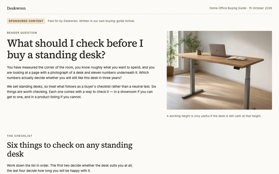
The first half gives six checks for any standing desk, each with a way to check it in a showroom or a product listing. The product section then answers the same six in order and ends with a 30-night home trial and a short configuration form. Use this format for considered purchases where the buyer is comparing look-alike products.
5. Comparison: a meal-prep container advertorial
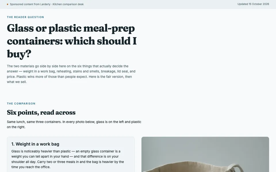
The page compares glass and plastic on six points with side-by-side photos, then says plainly where plastic is the better choice and who should buy it. Only then does it introduce a glass set, for the readers who chose glass. Admitting where the alternative wins is what makes the rest credible. Use this format when buyers already know the familiar alternative.
6. B2B problem piece: an invoicing software advertorial
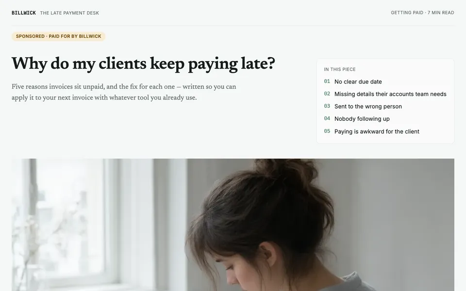
Written like a newsletter for freelancers, the page gives five reasons invoices are paid late and a fix for each that needs no new software, including sample reminder emails. The app appears in the second half as one way to automate the five fixes, with a free trial that needs no card. It ends with the five fixes again as a list readers can keep. Use this format for software and services: give away the method, sell the automation.
What the six examples have in common
| Example | Headline is | First half gives | Risk reducer |
|---|---|---|---|
| Sleep | The reader’s question | Causes and free fixes | 100-night trial |
| Pet food | The reader’s question | Five label checks | Discounted first box |
| Running shoes | A numbered list | Seven checks with photos | Free 30-day returns |
| Standing desk | The reader’s question | Six buying checks | 30-night home trial |
| Meal-prep containers | The reader’s choice | A fair comparison | A clear verdict on who should buy plastic |
| Invoicing software | The reader’s question | Five fixes for any tool | Free trial, no card |
Every page is labelled as sponsored at the top, holds the product back until the reader has something useful, and sends every button to one offer. To build your own on the same pattern, start from the advertorial template.